Typewriter Effect using CSS
1. Basic Typewriter Effect without cursor:-
-
Output:-
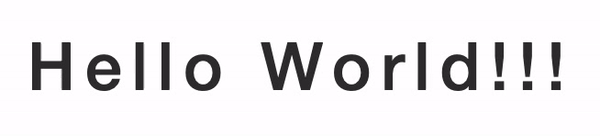
-
HTML Input:-
 <div class="typewriter">
    <h1>Hello World!!!</h1>
 </div>
-
CSS Input:-
.typewriter h1 {
    overflow: hidden; /* To hide the content until the animation is complete */
    white-space: nowrap; /* To keep content in a single line */
    letter-spacing: .10em; /* Gap between the letters */
    animation: typing 4.5s steps(40, end);
}

/* The typing effect */
@keyframes typing {
    from {
        width: 0% /* Animation Starting Point */
    }

    to {
        width: 100% /* Animation Stoping Point*/
    }
}
Here, @keyframes is the CSS property which specifies the animation code. It is used to explicitly execute the animation properties when applied.
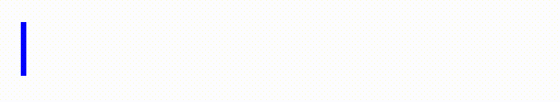
2. Typewriter Effect Styling with Cursor:-
-
Output:-

-
CSS Input:-
By adding the following CSS property in the above-mentioned CSS Input, we can achieve the given output:-
border-right: .10em solid blue; /* Cursor Styling */
-
Output:-
-
CSS Input:-
By adding the following CSS property in the above-mentioned CSS Input, we can achieve the given output:-
.typewriter h1{
animation: typing 4.5s steps(40, end),
           blink .65s step-end infinite;
}
/*Cursor Blink Effect*/
@keyframes blink {
    50% {
        border-color: black;
    }
}
Some tips for using the Typewriter Effect in CSS:-
Use "font-family: monospace;" for better styling as all the letter under monospace will have equal width.

CSS Syntax for Animation:
animation: name duration timing-function delay iteration-count direction fill-mode play-state;